OGL-Controller Node
The OGL-Controller Node creates a handle for a drawing or peg in the scene. This controller provides a rendered icon that can be clicked with the transform tool, and when clicked, will select the drawing or peg to which it is connected.
The OGL-Controller node is beneficial when there are objects that are difficult to select based on their position in the scene. The node can be labeled, does not require any drawing to be loaded, and is not visible when the scene is rendered.
The OGL Controller consists of the label text and the controller shape placed behind. The styling of the label and the controller may be adjusted in the Layer Properties for the OGL-Controller node.
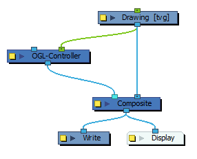
The following image is an example of a network for the OGL-Controller Node.
Properties
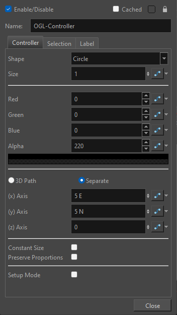
Controller
| Parameter | Description |
| Shape |
The shape of the OGL Controller. The default shape and colour for the OGL Controller is a blue circle. The following shapes are available:
|
| Size | The value specifying the size of the OGL Controller. |
| Red, Green, Blue, and Alpha | The RGB values specifying the OGL Controller's colour and transparency. For each colour, a value may be entered between 0 and 255. |
| Icon Position | The OGL Controller’s position is defined by a 3D column, or separate position values. These values define a X,Y,Z offset of the shape provided by the OGL controller in the scene. This offset is applied to the OGL Controller’s icon after it has been transformed by the node attached to the rightmost port. |
| Constant Size | Makes the size of the controller consistent regardless of the zoom level in the camera view. |
| Preserve Proportions | Preserves the proportions of the controller when the scale is changed on the input peg. |
| Setup Mode | When enabled, allows you to change the offset position of the label and OGL Controller by clicking and dragging when using the Transform tool. |
Selection
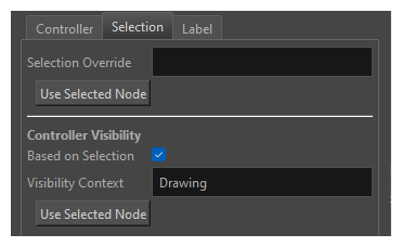
| Parameter | Description |
| Selection Override |
With a valid relative path entered in Selection Override, selecting the controller with the transform tool in the camera view will select the overriding node entered in the selection context. NOTE Only nodes that can be directly selected in the camera view are currently supported.
|
| Use Selected Node | Click this button to automatically input the name and relative path of the selected node in the Selection Override field. |
| Controller Visbility | |
| Based on Selection | When enabled, the controller will only appear when the node specified in the Visibility Context field or one of its children within the same group is selected. Only one node can be used in this field. |
| Visibility Context |
Used to define when a controller is visible and selectable in the camera view. With Based on Selection enabled and a valid relative path entered, the controller will become visible when the node is selected or when a connected node below is selected. |
| Use Selected Node |
Click this button to automatically input the name and relative path of the selected node in the Visibility Context field. |
Label
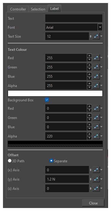
| Parameter | Description |
| Text | Text label to display with the Controller. Leave the field empty if no label is desired. |
| Font | The font used in the text label |
| Text Size | The size of the text in the label. |
| Text Colour | The RGBA values specifying the text colour and transparency. For each, a value may be entered between 0 and 255. |
| Background Box | Check this box to have a box be drawn behind the label to improve readability. Red, Green, Blue and Alpha values can be used to define the colour of the box. |
| Text Position | The text’s position is defined by a 3D column, or separate position values. These values define a X,Y,Z offset of the text provided by the OGL controller in the scene. This offset is applied to the OGL Controller’s text after it has been transformed by the node attached to the rightmost port and after the icon’s offset is applied. |