The Function Wizard dialog box allows you to easily create Master Controller widgets that are programmed to control specific attributes in a node. It works by letting you select a type of widget, a type of operation, one or several nodes and the node attribute to control, and generates a fully functional Master Controller node that controls the selected attribute in the selected nodes.
The Function Wizard automatically generates the script to make your Master Controller work, so you don’t need to have scripting knowledge to use this wizard. However, it also allows you to customize the script it generates from within the wizard. Hence, users who are familiar with Harmony scripting can easily change or expand the capacities of the Master Controller they’re creating. They can use this wizard to create a “basic” Master Controller and use it as a foundation to develop a much more complex Master Controller. Users who are less familiar with scripting can also look at the script generated to learn how scripting with Master Controllers works.
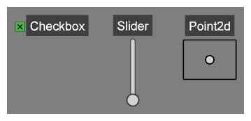
To use the Function Wizard, you must first identify and select a node for which you want to create a widget. The resulting widget, which will appear in the Camera View, can be configured to perform the following operations:
- Control the value of one of a node’s numerical (scalar) attributes (e.g., horizontal position, vertical position, etc.)
- Control the value of one of a node’s 2D (vector) attributes (e.g., position, scale, etc.)
- Toggle whether a node is enabled or disabled
- Show or hide the controls for a node
- Show or hide the deformation controls for a deformation chain
 How to access the Function Wizard
-
Add the Master Controller toolbar to your workspace by doing one of the following:
- Right-click on an existing toolbar and select Master Controller.
- In the top menu, select Windows > Toolbars > Master Controller.
The Master Controller toolbar appears.
- In the Node or Timeline view, select the nodes that you want to control with a Master Controller.
-
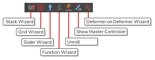
In the Master Controller toolbar, click the
 Function Wizard button.
| Icon | Parameter | Description |
|---|---|---|
| Controller Type |
The type of Master Controller widget to create. The Function Wizard can generate a widget of the following types:
|
|
| Operation |
The operation to execute on the selected nodes, on their selected attribute, when the user manipulates the widget. Depending on the selected controller types, the following operations are available:
|
|
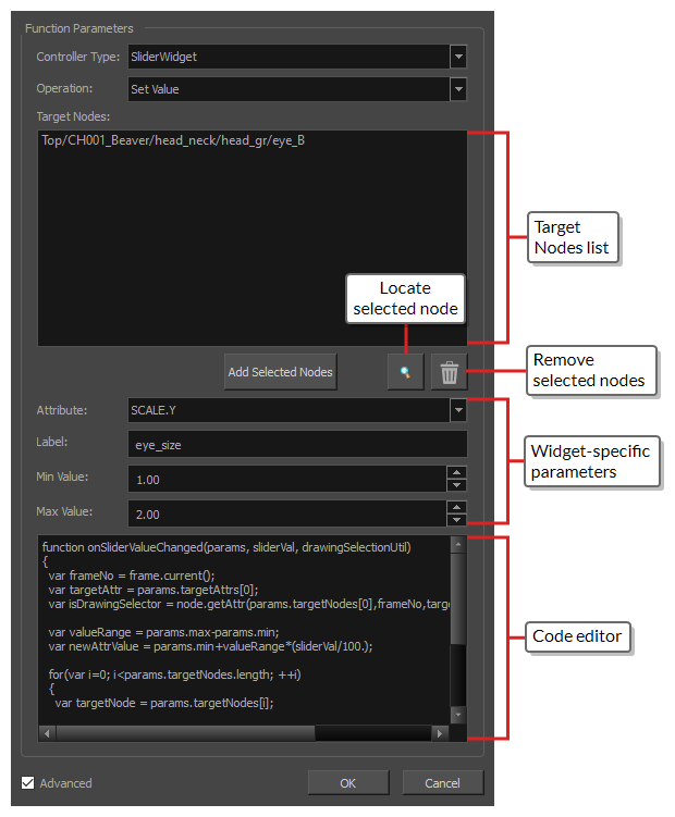
| Target Nodes |
The list of nodes that the Master Controller will affect. When you open the Function Wizard, this list is automatically filled with the currently selected nodes in your scene. The list of target nodes can be edited using the buttons just below it. NOTES
|
|
| Add Selected Nodes | Adds the nodes that are currently selected in the scene, whether from the Timeline view, Node View or Camera view, to the list of Target Nodes in the Function Wizard. | |
/Toon Boom Animation/Toon Boom Harmony 20 Premium/resources/icons/library/find@light.svg)
|
Locate Selected Node | Instantly navigates, in the Node View, to the node that is currently selected in the Target Nodes list, and selects it. |
|
Remove Node | Remove the nodes that are selected in the Target Nodes list from the Target Nodes list. |
|
Slider widget parameters
|
||
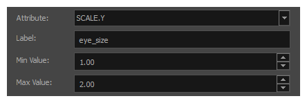
| Attribute |
Allows you to select which attribute in the target nodes that the slider widget will control. This drop-down will display all numerical (scalar) attributes available for the selected nodes. NOTE If several nodes of different types (i.e.: Peg, element, effect, composite, etc.) are in the Target Nodes list, only attributes that are common to all the target nodes will be available.
|
|
| Label |
The label text to display over the widget, to make it easy to identify in the Cameras view. This value is also used to name the Master Controller node that will be created. The Master Controller node will be named mc_ followed by the name in the Label, with spaces replaced by underscores (_). |
|
| Min Value | The value returned by the slider when it is set to its lowest position. | |
| Max Value | The value returned by the slider when it is set to its highest position. | |
|
Point2d widget parameters
|
||
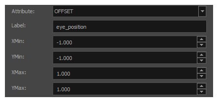
| Attribute |
Allows you to select which attribute in the target nodes that the slider widget will control. This drop-down will display all vector-type attributes available for the selected nodes. Vector-type attributes are attributes that have X and Y sub-attributes, which can be set to the X and Y coordinates of the 2D point as it is manipulated. NOTE If several nodes of different types (i.e.: Peg, element, effect, composite, etc.) are in the Target Nodes list, only attributes that are common to all the target nodes will be available.
|
|
| Label |
The label text to display over the widget, to make it easy to identify in the Cameras view. This value is also used to name the Master Controller node that will be created. The Master Controller node will be named mc_ followed by the name in the Label, with spaces replaced by underscores (_). |
|
| XMin |
The value returned by the 2D point widget for the X coordinate when it is at its leftmost position. |
|
| XMax | The value returned by the 2D point widget for the X coordinate when it is at its rightmost position. | |
| YMin | The value returned by the 2D point widget for the Y coordinate when it is at its bottommost position. | |
| YMax | The value returned by the 2D point widget for the Y coordinate when it is at its topmost position. | |
|
Checkbox widget parameters
|
||
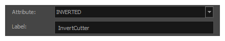
| Attribute |
Allows you to select which attribute in the target nodes that the checkbox widget will toggle. This drop-down will display all boolean-type attributes available for the selected nodes. This drop-down will be greyed out if you selected an operation that toggles something other than an attribute, such as Enable/Disable Nodes, Show/Hide Node Controls and Show/Hide Deformers. NOTES
|
|
| Label |
The label text to display over the widget, to make it easy to identify in the Cameras view. This value is also used to name the Master Controller node that will be created. The Master Controller node will be named mc_ followed by the name in the Label, with spaces replaced by underscores (_). |
|
| Additional parameters | ||
| Function Code |
The function that is executed when the Master Controller widget is manipulated. This script can be edited within the Function Wizard, and any changes you make to the script will actually be carried over to the Master Controller that the wizard will create. Hence, not only this field allows you to learn what the code for a basic Master Controller looks like, it can also allow you to create Master Controllers that have more complex effects than what is supported by the Function Wizard. TIP You can also modify this code at any time after you created your Master Controller. To make changes to this code, simply open the Layer Properties for the Master Controller node, and then select the UI Script tab.
|
|
| Advanced |
By default, several of the target node’s attributes are hidden in the Attribute drop-down so as to avoid cluttering it. In Advanced mode, all of the target node’s attributes that are compatible with your Master Controller widget will be listed in the Attribute drop-down, giving you more options for which attribute of the target node the Master Controller will manipulate. |
|